Retourner à : Angular en 2026
Nous savons maintenant comment créer des formulaires avec Angular. Ces formulaires fonctionnent, mais ne sont pas très esthétiques. Heureusement, Angular Material est là pour nous aider en proposant des composants UI modernes et cohérents, qui s’adhèrent aux principes du Material Design.
Dans ce chapitre nous allons voir:
- ce qu’est Angular Material,
- comment installer Angular Material dans un projet Angular existant,
- comment utiliser les composants Angular Material dans nos projets,
- et pour finir, nous verrons comment personaliser le style d’un composant.
A la fin de ce chapitre, nous aurons un formulaire de création et modification d’objets de collections, qui utilisera les composants Angular Material pour chacun des inputs et boutons de notre interface.
Pour rappel, tout au long de ce cours, on va créer une application de gestion de collections de timbres, pièces, figurines, cartes à jouer ou autre.
Introduction
Commençons par expliquer ce qu’est Angular Material. Angular Material est une librairie de composants graphiques basée sur les spécifications Material Design de Google. Angular Material fournit un large éventail de composants, tels que des boutons, des inputs, des menus, et bien plus. En plus de cela, les composants sont responsifs et facilement personnalisables.
Il est important de noter qu’Angular Material a été créé et est maintenu par l’équipe d’Angular. Cela apporte plusieurs avantages. Premièrement, la bibliothèque est toujours à jour et suit les évolutions du framework Angular. Deuxièmement, la bibliothèque adhère à des standards élevés et éprouvés, notamment en ce qui concerne l’accessibilité et la personnalisation des composants.
En plus de cela, Angular Material possède une documentation détaillée de chaque composant et chaque fonctionnalité proposés par la librairie.
Installation
Voyons maintenant comment installer Angular Material dans un projet existant. Pour cela, on va ouvrir le dossier de notre projet dans le terminal et taper l’instruction suivante :
ng add @angular/materialUne fois la commande exécutée, on doit encore choisir un thème que nous souhaitons utiliser. Pour cela, il suffit de choisir le thème souhaité avec les flèches du clavier et de valider la sélection.
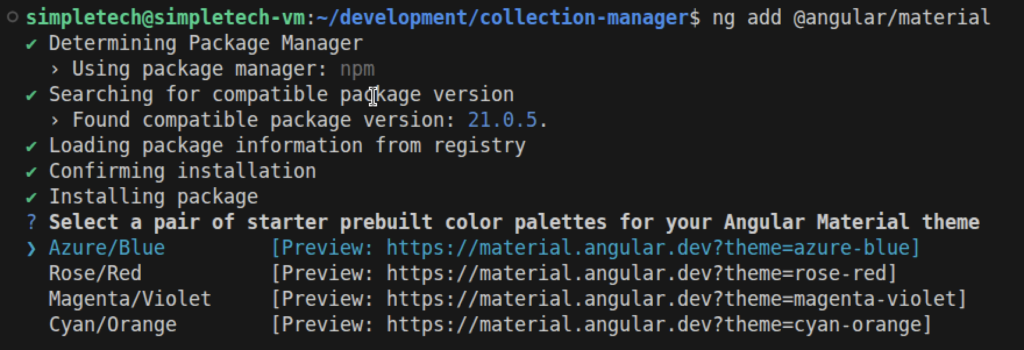
Pour les exemples utilisés dans ce chapitre, on va utiliser le thème Azure/Blue. Et c’est déjà tout, nous pouvons maintenant utiliser les composants Angular Material dans notre projet.
Utilisation des composants Angular Material
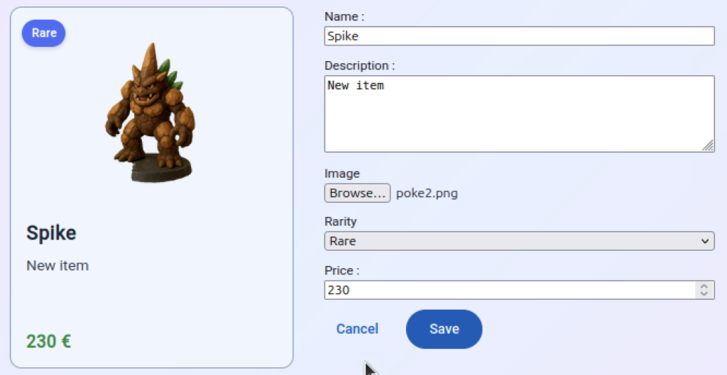
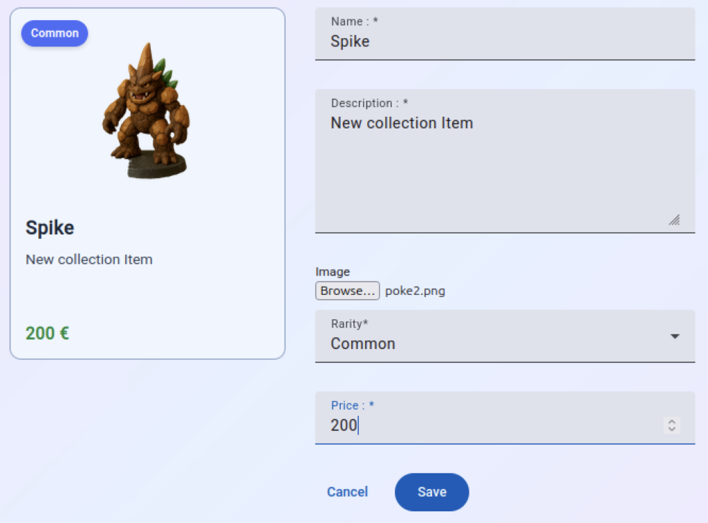
Avant de regarder exactement comment utiliser les composants Angular Material, regardons à quoi ressemble notre composant CollectionItemDetail dans notre navigateur. Pour cela, on doit naviguer vers la page http://localhost:4200/item :
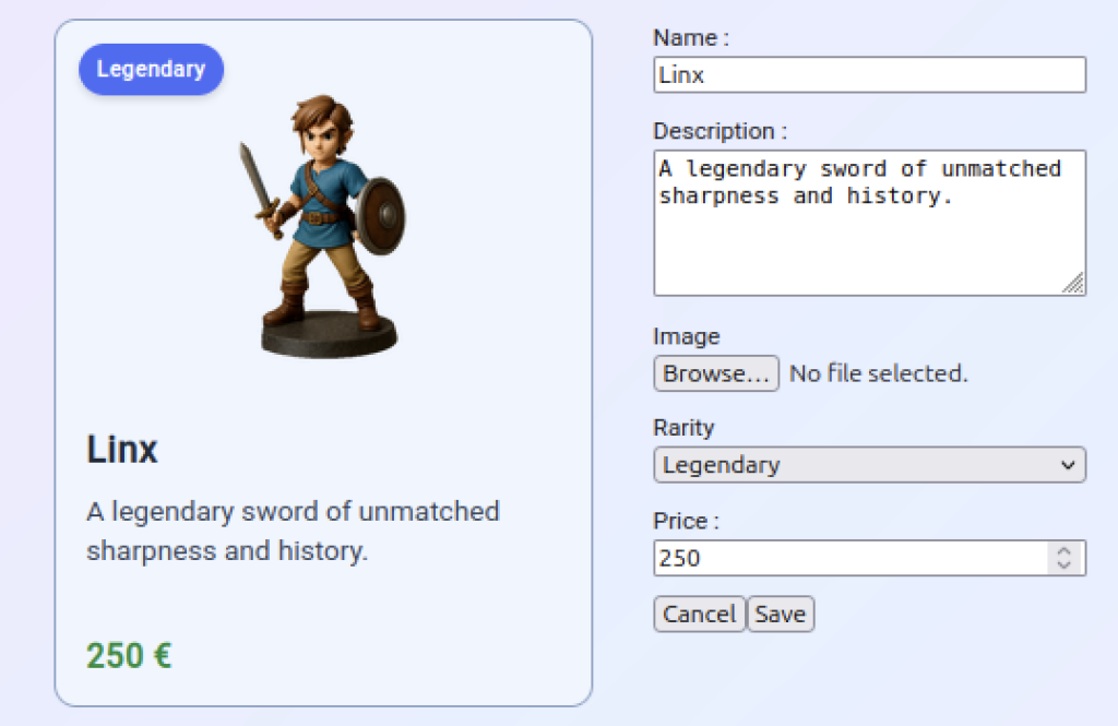
Sur ce formulaire, on peut voir différents inputs et deux boutons. Commençons par adapter nos boutons afin d’utiliser Angular Material. La première chose à faire est de vérifier s’il y a un composant Angular Material qui corresponde à notre besoin. Pour cela, on peut se rendre à la page https://material.angular.io et cliquer sur le menu « components » pour voir la liste des composants disponibles.
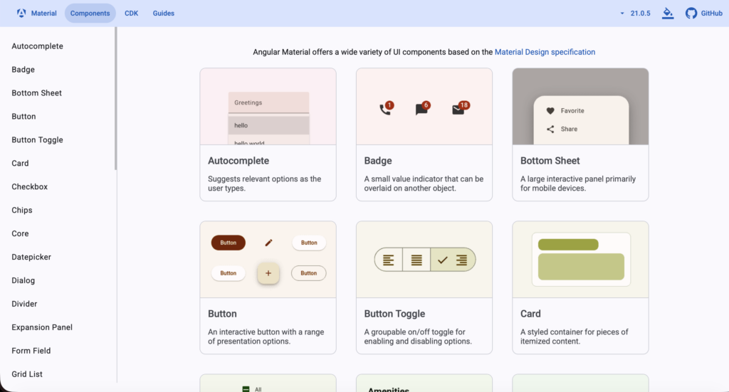
Sur cette page, on voit bien qu’Angular Material met des boutons à disposition. Si on clique sur le composant Button, on arrive sur une page dédiée aux boutons.
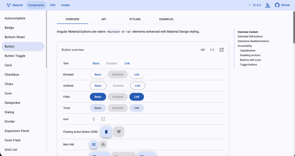
Cette page est divisée en quatre tabs :
- Overview: donne une vue d’ensemble du composant.
- API: explique en détail chaque paramètre du composant. Notez qu’à la première ligne, on retrouve le module à importer, qui met ce composant à disposition.
- Styling: indique les différents paramètres de style qui peuvent être modifiés afin de personnaliser le composant.
- Examples: contient plein d’exemples différents d’utilisation.
Pour notre exemple, on aura besoin de deux types de boutons; un bouton « filled » pour le bouton « Save », et un bouton « text » pour le « Cancel ». En cliquant sur le bouton « < > », on peut révéler le code source des boutons affichés à l’écran :
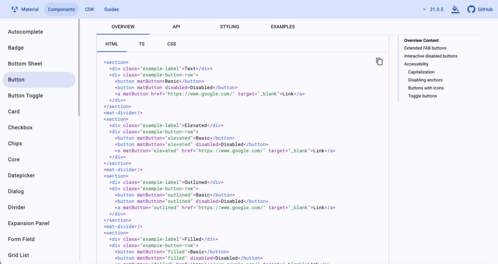
Comme on peut le voir, pour créer un bouton de type « text », il suffit de rajouter l’attribut matButton à notre bouton, et pour le bouton de type « filled », on utilise l’attribut matButton avec la valeur « filled » :
<app-collection-item-card [item]="collectionItem()" />

<form [formGroup]="itemFormGroup" (submit)="submit($event)">
    <div class="form-field">
        <label for="name">Name : </label>
        <input id="name" name="name" formControlName="name"/>
        @if (isFieldValid('name')) {
            <div class="error">This field is required!</div>
        }
    </div>
    <div class="form-field">
        <label for="description">Description : </label>
        <textarea id="description" name="description" formControlName="description" rows="5"></textarea>
        @if (isFieldValid('description')) {
            <div class="error">This field is required!</div>
        }
    </div>
    <div class="form-field">
        <label for="image">Image</label>
        <input id="image" name="image" type="file" (change)="onFileChange($event)">
        @if (isFieldValid('image')) {
            <div class="error">This field is required.</div>
        }
    </div>
    <div class="form-field">
        <label for="rarity">Rarity</label>
        <select id="rarity" name="rarity" formControlName="rarity">
        @for (rarity of rarities; track rarity) {
            <option [value]="rarity">{{rarity}}</option>
        }
        </select>
    </div>
    <div class="form-field">
        <label for="price">Price : </label>
        <input id="price" name="price" formControlName="price" type="number"/>
        @if (isFieldValid('price')) {
            @let priceFormControl = itemFormGroup.get('price');
            @if (priceFormControl?.hasError('required')) {
                <div class="error">This field is required!</div>
            }
            @if (priceFormControl?.hasError('min')) {
                <div class="error">The value must be bigger or equal to 0!</div>
            }
        }
    </div>
    <div class="action-buttons">
        <button matButton="text" type="button" (click)="cancel()">Cancel</button>
        <button matButton="filled" type="submit"
            [disabled]="itemFormGroup.invalid"
        >
            Save
        </button>
        @if (this.itemId()) {
            <button type="button" (click)="deleteItem()">Delete</button>
        }
    </div>
</form>En plus de cela, afin d’utiliser matButton, nous devons importer MatButtonModule de « @angular/material/button » et le rajouter à la liste d’imports du composant :
import { Component, effect, inject, input, linkedSignal, OnDestroy, OnInit, signal, } from '@angular/core';
import { Router } from '@angular/router';
import { FormBuilder, ReactiveFormsModule, Validators } from "@angular/forms";
import { CollectionItem, Rarities } from '../../models/collection-item';
import { CollectionItemCard } from "../../components/collection-item-card/collection-item-card";
import { Subscription } from 'rxjs';
import { CollectionService } from '../../services/collection-service';
import { Collection } from '../../models/collection';
import { MatButtonModule } from '@angular/material/button';

@Component({
  selector: 'app-collection-item-detail',
  imports: [ReactiveFormsModule, CollectionItemCard, MatButtonModule],
  templateUrl: './collection-item-detail.html',
  styleUrl: './collection-item-detail.scss'
})
export class CollectionItemDetail implements OnDestroy {

  private readonly fb = inject(FormBuilder);
  private readonly router = inject(Router);
  private readonly collectionService = inject(CollectionService);

  rarities = Object.values(Rarities);

  itemId = input<number | null, string | null>(null, {
    alias: 'id',
    transform: ((id: string | null) => id ? parseInt(id) : null)
  });

  selectedCollection!: Collection;
  collectionItem = signal<CollectionItem>(new CollectionItem());

  itemFormGroup = this.fb.group({
    name: ['', [Validators.required]],
    description: ['', [Validators.required]],
    image: ['', [Validators.required]],
    rarity: ['', [Validators.required]],
    price: [0, [Validators.required, Validators.min(0)]]
  });

  valueChangeSubscription: Subscription | null = null;

  constructor() {
    effect(() => {
      let itemToDisplay =  new CollectionItem();
      this.selectedCollection = this.collectionService.getAll()[0];
      if (this.itemId()) {
        const itemFound = this.selectedCollection.items.find(item => item.id === this.itemId());
        if (itemFound) {
          itemToDisplay = itemFound;
        } else {
          this.router.navigate(['not-found']);
        }
      }
      this.itemFormGroup.patchValue(itemToDisplay);
    });

    this.valueChangeSubscription = this.itemFormGroup.valueChanges.subscribe(_ => {
      this.collectionItem.set(Object.assign(new CollectionItem(), this.itemFormGroup.value));
    });
  }

  submit(event: Event) {
    event.preventDefault();

    const itemId = this.itemId();
    if (itemId) {
      this.collectionItem().id = itemId;
      this.collectionService.updateItem(this.selectedCollection, this.collectionItem());
    } else {
      this.collectionService.addItem(this.selectedCollection, this.collectionItem());
    }

    this.router.navigate(['/']);
  }

  deleteItem() {
    const itemId = this.itemId();
    if (itemId) {
      this.collectionService.deleteItem(this.selectedCollection.id, itemId);
    }
    this.router.navigate(['/']);
  }

  cancel() {
    this.router.navigate(['/']);
  }

  isFieldValid(fieldName: string) {
    const formControl = this.itemFormGroup.get(fieldName);
    return formControl?.invalid && (formControl?.dirty || formControl?.touched);
  }

  onFileChange(event: any) {
    const reader = new FileReader();
    if (event.target.files && event.target.files.length) {
      const [file] = event.target.files;
      reader.readAsDataURL(file);
      reader.onload = () => {
        this.itemFormGroup.patchValue({
          image: reader.result as string
        });
      };
    }
  }

  ngOnDestroy(): void {
    this.valueChangeSubscription?.unsubscribe();
  }

}Ajoutons aussi la classe action-buttons à notre css, et adaptons le css afin de rendre le formulaire plus large et d’espacer un peu les boutons :
form {
    max-width: 400px;
    width: calc(100% - 350px);
}

.form-field {
    display: flex;
    flex-direction: column;
    margin: 10px 0;
}

label {
    font-size: small;
}

.ng-dirty.ng-invalid, .ng-touched.ng-invalid {
    border-color: red;
    border-width: 1px;
}

.error {
    font-size: x-small;
    color: red;
}

app-collection-item-card {
    margin: 10px 0;
}

:host {
    display: flex;
    gap: 2rem;
    justify-content: center;
}

.action-buttons {
    display: flex;
    gap: 1rem;
}Avant de regarder le résultat, j’aimerais qu’on adapte encore le fichier « collection-item.ts ». Jusqu’à présent quand on créait un nouvel objet de collection, on lui assignait un nom, une description, etc… par défaut. Nous allons maintenant enlever toutes ces valeurs par défaut :
export const Rarities = {
  Legendary: 'Legendary',
  Rare: 'Rare',
  Uncommon: 'Uncommon',
  Common: 'Common',
} as const;
export type Rarity = typeof Rarities[keyof typeof Rarities];

export class CollectionItem {

    id = -1;
    name = "";
    description = "";
    image = "";
    rarity: Rarity = "Common";
    price = 0;

    copy(): CollectionItem {
        return Object.assign(new CollectionItem(), this);
    }

}Maintenant, si on regarde notre navigateur, on voit bien le formulaire avec les deux MatButton :
Faisons maintenant la même chose pour nos inputs. Si on ouvre la documentation des inputs, on voit la chose suivante :
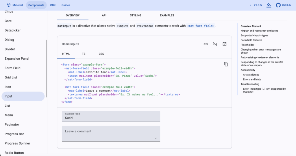
Ici, on voit qu’on va devoir adapter notre code afin d’utiliser un mat-form-field qui va contenir un mat-label, qui va décrire notre input, et on va aussi devoir ajouter un attribut matInput à notre input. Dans l’onglet API, on voit qu’on doit ajouter MatInputModule – qui doit être importé de « @angular/material/input » – à nos imports.
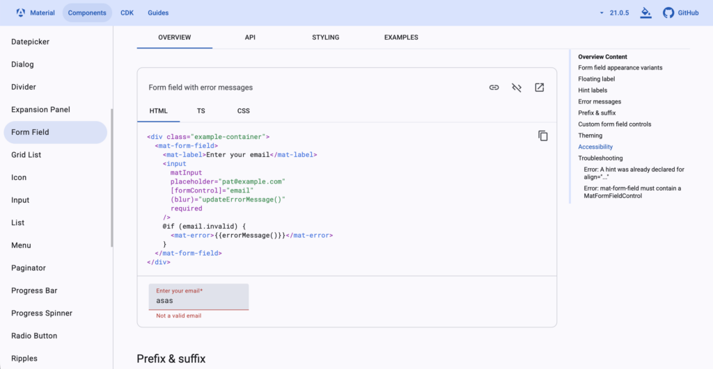
En plus de cela, comme on construit un formulaire, avec des règles de validations qui peuvent générer des erreurs, on peut aussi utiliser mat-error pour afficher les erreurs. mat-error est décrit dans la documentation de Form Field :
Commençons par ajouter MatInputModule à notre fichier TypeScript :
import { Component, effect, inject, input, linkedSignal, OnDestroy, OnInit, signal, } from '@angular/core';
import { Router } from '@angular/router';
import { FormBuilder, ReactiveFormsModule, Validators } from "@angular/forms";
import { CollectionItem, Rarities } from '../../models/collection-item';
import { CollectionItemCard } from "../../components/collection-item-card/collection-item-card";
import { Subscription } from 'rxjs';
import { CollectionService } from '../../services/collection-service';
import { Collection } from '../../models/collection';
import { MatButtonModule } from '@angular/material/button';
import { MatInputModule } from '@angular/material/input';

@Component({
  selector: 'app-collection-item-detail',
  imports: [ReactiveFormsModule, CollectionItemCard, MatButtonModule, MatInputModule],
  templateUrl: './collection-item-detail.html',
  styleUrl: './collection-item-detail.scss'
})
export class CollectionItemDetail implements OnDestroy {

  private readonly fb = inject(FormBuilder);
  private readonly router = inject(Router);
  private readonly collectionService = inject(CollectionService);

  rarities = Object.values(Rarities);

  itemId = input<number | null, string | null>(null, {
    alias: 'id',
    transform: ((id: string | null) => id ? parseInt(id) : null)
  });

  selectedCollection!: Collection;
  collectionItem = signal<CollectionItem>(new CollectionItem());

  itemFormGroup = this.fb.group({
    name: ['', [Validators.required]],
    description: ['', [Validators.required]],
    image: ['', [Validators.required]],
    rarity: ['', [Validators.required]],
    price: [0, [Validators.required, Validators.min(0)]]
  });

  valueChangeSubscription: Subscription | null = null;

  constructor() {
    effect(() => {
      let itemToDisplay =  new CollectionItem();
      this.selectedCollection = this.collectionService.getAll()[0];
      if (this.itemId()) {
        const itemFound = this.selectedCollection.items.find(item => item.id === this.itemId());
        if (itemFound) {
          itemToDisplay = itemFound;
        } else {
          this.router.navigate(['not-found']);
        }
      }
      this.itemFormGroup.patchValue(itemToDisplay);
    });

    this.valueChangeSubscription = this.itemFormGroup.valueChanges.subscribe(_ => {
      this.collectionItem.set(Object.assign(new CollectionItem(), this.itemFormGroup.value));
    });
  }

  submit(event: Event) {
    event.preventDefault();

    const itemId = this.itemId();
    if (itemId) {
      this.collectionItem().id = itemId;
      this.collectionService.updateItem(this.selectedCollection, this.collectionItem());
    } else {
      this.collectionService.addItem(this.selectedCollection, this.collectionItem());
    }

    this.router.navigate(['/']);
  }

  deleteItem() {
    const itemId = this.itemId();
    if (itemId) {
      this.collectionService.deleteItem(this.selectedCollection.id, itemId);
    }
    this.router.navigate(['/']);
  }

  cancel() {
    this.router.navigate(['/']);
  }

  isFieldValid(fieldName: string) {
    const formControl = this.itemFormGroup.get(fieldName);
    return formControl?.invalid && (formControl?.dirty || formControl?.touched);
  }

  onFileChange(event: any) {
    const reader = new FileReader();
    if (event.target.files && event.target.files.length) {
      const [file] = event.target.files;
      reader.readAsDataURL(file);
      reader.onload = () => {
        this.itemFormGroup.patchValue({
          image: reader.result as string
        });
      };
    }
  }

  ngOnDestroy(): void {
    this.valueChangeSubscription?.unsubscribe();
  }

}Dans notre html, nous allons maintenant adapter nos input de type « text », « number » et notre « textarea » :
<app-collection-item-card [item]="collectionItem()" />

<form [formGroup]="itemFormGroup" (submit)="submit($event)">
    <mat-form-field class="form-field">
        <mat-label for="name">Name : </mat-label>
        <input matInput id="name" name="name" formControlName="name"/>
        @if (isFieldValid('name')) {
            <mat-error>This field is required!</mat-error>
        }
    </mat-form-field>
    <mat-form-field class="form-field">
        <mat-label for="description">Description : </mat-label>
        <textarea matInput id="description" name="description" formControlName="description" rows="5"></textarea>
        @if (isFieldValid('description')) {
            <mat-error>This field is required!</mat-error>
        }
    </mat-form-field>
    <div class="form-field">
        <label for="image">Image</label>
        <input id="image" name="image" type="file" (change)="onFileChange($event)">
        @if (isFieldValid('image')) {
            <div class="error">This field is required.</div>
        }
    </div>
    <div class="form-field">
        <label for="rarity">Rarity</label>
        <select id="rarity" name="rarity" formControlName="rarity">
        @for (rarity of rarities; track rarity) {
            <option [value]="rarity">{{rarity}}</option>
        }
        </select>
    </div>
    <mat-form-field class="form-field">
        <mat-label for="price">Price : </mat-label>
        <input matInput id="price" name="price" formControlName="price" type="number"/>
        @if (isFieldValid('price')) {
            @let priceFormControl = itemFormGroup.get('price');
            @if (priceFormControl?.hasError('required')) {
                <mat-error>This field is required!</mat-error>
            }
            @if (priceFormControl?.hasError('min')) {
                <mat-error>The value must be bigger or equal to 0!</mat-error>
            }
        }
    </mat-form-field>
    <div class="action-buttons">
        <button matButton="text" type="button" (click)="cancel()">Cancel</button>
        <button matButton="filled" type="submit"
            [disabled]="itemFormGroup.invalid"
        >
            Save
        </button>
        @if (this.itemId()) {
            <button type="button" (click)="deleteItem()">Delete</button>
        }
    </div>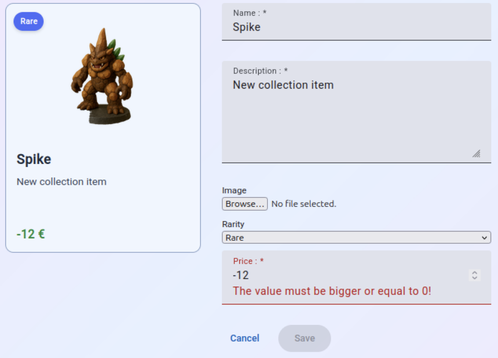
</form>Une fois ces modifications faites, on obtient le résultat suivant :
Pour notre dropdown, on peut utiliser le MatSelect :
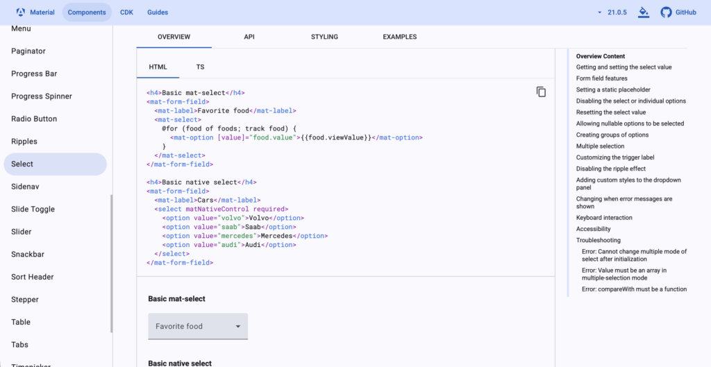
Pour l’utiliser, on a besoin de trois choses:
- remplacer notre select par mat-select,
- remplacer les option par mat-option,
- importer MatSelectModule de « @angular/material/select ».
Ajoutons d’abord l’import :
import { Component, effect, inject, input, linkedSignal, OnDestroy, OnInit, signal, } from '@angular/core';
import { Router } from '@angular/router';
import { FormBuilder, ReactiveFormsModule, Validators } from "@angular/forms";
import { CollectionItem, Rarities } from '../../models/collection-item';
import { CollectionItemCard } from "../../components/collection-item-card/collection-item-card";
import { Subscription } from 'rxjs';
import { CollectionService } from '../../services/collection-service';
import { Collection } from '../../models/collection';
import { MatButtonModule } from '@angular/material/button';
import { MatInputModule } from '@angular/material/input';
import { MatSelectModule } from '@angular/material/select';

@Component({
  selector: 'app-collection-item-detail',
  imports: [ReactiveFormsModule, CollectionItemCard, MatButtonModule, MatInputModule, MatSelectModule],
  templateUrl: './collection-item-detail.html',
  styleUrl: './collection-item-detail.scss'
})
export class CollectionItemDetail implements OnDestroy {

  private readonly fb = inject(FormBuilder);
  private readonly router = inject(Router);
  private readonly collectionService = inject(CollectionService);

  rarities = Object.values(Rarities);

  itemId = input<number | null, string | null>(null, {
    alias: 'id',
    transform: ((id: string | null) => id ? parseInt(id) : null)
  });

  selectedCollection!: Collection;
  collectionItem = signal<CollectionItem>(new CollectionItem());

  itemFormGroup = this.fb.group({
    name: ['', [Validators.required]],
    description: ['', [Validators.required]],
    image: ['', [Validators.required]],
    rarity: ['', [Validators.required]],
    price: [0, [Validators.required, Validators.min(0)]]
  });

  valueChangeSubscription: Subscription | null = null;

  constructor() {
    effect(() => {
      let itemToDisplay =  new CollectionItem();
      this.selectedCollection = this.collectionService.getAll()[0];
      if (this.itemId()) {
        const itemFound = this.selectedCollection.items.find(item => item.id === this.itemId());
        if (itemFound) {
          itemToDisplay = itemFound;
        } else {
          this.router.navigate(['not-found']);
        }
      }
      this.itemFormGroup.patchValue(itemToDisplay);
    });

    this.valueChangeSubscription = this.itemFormGroup.valueChanges.subscribe(_ => {
      this.collectionItem.set(Object.assign(new CollectionItem(), this.itemFormGroup.value));
    });
  }

  submit(event: Event) {
    event.preventDefault();

    const itemId = this.itemId();
    if (itemId) {
      this.collectionItem().id = itemId;
      this.collectionService.updateItem(this.selectedCollection, this.collectionItem());
    } else {
      this.collectionService.addItem(this.selectedCollection, this.collectionItem());
    }

    this.router.navigate(['/']);
  }

  deleteItem() {
    const itemId = this.itemId();
    if (itemId) {
      this.collectionService.deleteItem(this.selectedCollection.id, itemId);
    }
    this.router.navigate(['/']);
  }

  cancel() {
    this.router.navigate(['/']);
  }

  isFieldValid(fieldName: string) {
    const formControl = this.itemFormGroup.get(fieldName);
    return formControl?.invalid && (formControl?.dirty || formControl?.touched);
  }

  onFileChange(event: any) {
    const reader = new FileReader();
    if (event.target.files && event.target.files.length) {
      const [file] = event.target.files;
      reader.readAsDataURL(file);
      reader.onload = () => {
        this.itemFormGroup.patchValue({
          image: reader.result as string
        });
      };
    }
  }

  ngOnDestroy(): void {
    this.valueChangeSubscription?.unsubscribe();
  }

}Nous pouvons maintenant modifier le fichier HTML :
<app-collection-item-card [item]="collectionItem()" />

<form [formGroup]="itemFormGroup" (submit)="submit($event)">
    <mat-form-field class="form-field">
        <mat-label for="name">Name : </mat-label>
        <input matInput id="name" name="name" formControlName="name"/>
        @if (isFieldValid('name')) {
            <mat-error>This field is required!</mat-error>
        }
    </mat-form-field>
    <mat-form-field class="form-field">
        <mat-label for="description">Description : </mat-label>
        <textarea matInput id="description" name="description" formControlName="description" rows="5"></textarea>
        @if (isFieldValid('description')) {
            <mat-error>This field is required!</mat-error>
        }
    </mat-form-field>
    <div class="form-field">
        <label for="image">Image</label>
        <input id="image" name="image" type="file" (change)="onFileChange($event)">
        @if (isFieldValid('image')) {
            <div class="error">This field is required.</div>
        }
    </div>
    <mat-form-field class="form-field">
        <mat-label for="rarity">Rarity</mat-label>
        <mat-select id="rarity" name="rarity" formControlName="rarity">
        @for (rarity of rarities; track rarity) {
            <mat-option [value]="rarity">{{rarity}}</mat-option>
        }
        </mat-select>
    </mat-form-field>
    <mat-form-field class="form-field">
        <mat-label for="price">Price : </mat-label>
        <input matInput id="price" name="price" formControlName="price" type="number"/>
        @if (isFieldValid('price')) {
            @let priceFormControl = itemFormGroup.get('price');
            @if (priceFormControl?.hasError('required')) {
                <mat-error>This field is required!</mat-error>
            }
            @if (priceFormControl?.hasError('min')) {
                <mat-error>The value must be bigger or equal to 0!</mat-error>
            }
        }
    </mat-form-field>
    <div class="action-buttons">
        <button matButton="text" type="button" (click)="cancel()">Cancel</button>
        <button matButton="filled" type="submit"
            [disabled]="itemFormGroup.invalid"
        >
            Save
        </button>
        @if (this.itemId()) {
            <button type="button" (click)="deleteItem()">Delete</button>
        }
    </div>
</form>Une fois modifié, le mat-select fonctionne comme attendu :
Passons maintenant à notre input de type « file« . Angular Material n’a pas de composant par défaut pour ce type d’input, mais nous avons un moyen assez simple de pallier à ce manque. Nous allons commencer par rendre notre input « hidden », et puis nous allons ajouter un MatButton qui se chargera d’exécuter le clic sur notre input de type « file » qui ne sera donc pas visible à l’écran :
<app-collection-item-card [item]="collectionItem()" />

<form [formGroup]="itemFormGroup" (submit)="submit($event)">
    <mat-form-field class="form-field">
        <mat-label for="name">Name : </mat-label>
        <input matInput id="name" name="name" formControlName="name"/>
        @if (isFieldValid('name')) {
            <mat-error>This field is required!</mat-error>
        }
    </mat-form-field>
    <mat-form-field class="form-field">
        <mat-label for="description">Description : </mat-label>
        <textarea matInput id="description" name="description" formControlName="description" rows="5"></textarea>
        @if (isFieldValid('description')) {
            <mat-error>This field is required!</mat-error>
        }
    </mat-form-field>
    <mat-form-field class="form-field">
        <mat-label for="rarity">Rarity</mat-label>
        <mat-select id="rarity" name="rarity" formControlName="rarity">
        @for (rarity of rarities; track rarity) {
            <mat-option [value]="rarity">{{rarity}}</mat-option>
        }
        </mat-select>
    </mat-form-field>
    <mat-form-field class="form-field">
        <mat-label for="price">Price : </mat-label>
        <input matInput id="price" name="price" formControlName="price" type="number"/>
        @if (isFieldValid('price')) {
            @let priceFormControl = itemFormGroup.get('price');
            @if (priceFormControl?.hasError('required')) {
                <mat-error>This field is required!</mat-error>
            }
            @if (priceFormControl?.hasError('min')) {
                <mat-error>The value must be bigger or equal to 0!</mat-error>
            }
        }
    </mat-form-field>
    <div class="form-field">
        <button matButton="elevated"
            (click)="$event.preventDefault(); imageUploader.click();"
        >
            Upload Image: {{ imageUploader.files?.[0]?.name || '...' }}
        </button>
        <input hidden #imageUploader id="image" name="image" type="file" (change)="onFileChange($event)">
        @if (isFieldValid('image')) {
            <div class="error">This field is required.</div>
        }
    </div><br>
    <div class="action-buttons">
        <button matButton="text" type="button" (click)="cancel()">Cancel</button>
        <button matButton="filled" type="submit"
            [disabled]="itemFormGroup.invalid"
        >
            Save
        </button>
        @if (this.itemId()) {
            <button type="button" (click)="deleteItem()">Delete</button>
        }
    </div>
</form>Avant de continuer modifiant encore deux choses:
- positionnons le bouton delete à gauche et changeons le en matButton de type « filled »,
- adaptons un peu notre css pour rendre le tout plus esthétique.
<app-collection-item-card [item]="collectionItem()" />

<form [formGroup]="itemFormGroup" (submit)="submit($event)">
    <mat-form-field class="form-field">
        <mat-label for="name">Name : </mat-label>
        <input matInput id="name" name="name" formControlName="name"/>
        @if (isFieldValid('name')) {
            <mat-error>This field is required!</mat-error>
        }
    </mat-form-field>
    <mat-form-field class="form-field">
        <mat-label for="description">Description : </mat-label>
        <textarea matInput id="description" name="description" formControlName="description" rows="5"></textarea>
        @if (isFieldValid('description')) {
            <mat-error>This field is required!</mat-error>
        }
    </mat-form-field>
    <mat-form-field class="form-field">
        <mat-label for="rarity">Rarity</mat-label>
        <mat-select id="rarity" name="rarity" formControlName="rarity">
        @for (rarity of rarities; track rarity) {
            <mat-option [value]="rarity">{{rarity}}</mat-option>
        }
        </mat-select>
    </mat-form-field>
    <mat-form-field class="form-field">
        <mat-label for="price">Price : </mat-label>
        <input matInput id="price" name="price" formControlName="price" type="number"/>
        @if (isFieldValid('price')) {
            @let priceFormControl = itemFormGroup.get('price');
            @if (priceFormControl?.hasError('required')) {
                <mat-error>This field is required!</mat-error>
            }
            @if (priceFormControl?.hasError('min')) {
                <mat-error>The value must be bigger or equal to 0!</mat-error>
            }
        }
    </mat-form-field>
    <div class="form-field">
        <button matButton="elevated"
            (click)="$event.preventDefault(); imageUploader.click();"
        >
            Upload Image: {{ imageUploader.files?.[0]?.name || '...' }}
        </button>
        <input hidden #imageUploader id="image" name="image" type="file" (change)="onFileChange($event)">
        @if (isFieldValid('image')) {
            <div class="error">This field is required.</div>
        }
    </div><br>
    <div class="action-buttons">
        <div class="left">
            @if (this.itemId()) {
                <button matButton="filled" type="button" (click)="deleteItem()">Delete</button>
            }
        </div>
        <div class="right">
            <button matButton="text" type="button" (click)="cancel()">Cancel</button>
            <button matButton="filled" type="submit"
                [disabled]="itemFormGroup.invalid"
            >
                Save
            </button>
        </div>
    </div>
</form>Nous pouvons maintenant adapter notre css :
form {
    max-width: 400px;
    width: calc(100% - 350px);
    background-color: white;
    padding: 1rem;
    margin-top: 10px;
    border-radius: 10px;
    border: 1px solid lightgray;
}

.form-field {
    display: flex;
    flex-direction: column;
    margin: 10px 0;
}

label {
    font-size: small;
}

.ng-dirty.ng-invalid, .ng-touched.ng-invalid {
    border-color: red;
    border-width: 1px;
}

.error {
    font-size: x-small;
    color: red;
}

app-collection-item-card {
    margin: 10px 0;
}

:host {
    display: flex;
    gap: 2rem;
    justify-content: center;
}

.action-buttons {
    display: flex;
    gap: 1rem;
    align-content: space-between;
}

.action-buttons .left, .action-buttons .right {
    display: flex;
    gap: 1;
    flex-grow: 1;
}

.action-buttons .right {
    justify-content: right;
}Une fois le tout sauvegardé, on obtient le résultat suivant :
Le bouton « Delete » devrait bien entendu avoir une autre couleur que le bouton « Save », mais nous y reviendrons dans un instant. Avant cela, on va encore adapter le composant CollectionDetail, qui possède lui aussi, un bouton qui doit utiliser Angular Material. Ici, ajoutons d’abord l’import à MatButtonModule au fichier TypeScript:
import { ChangeDetectionStrategy, Component, computed, inject, model, signal } from '@angular/core';
import { SearchBar } from "../../components/search-bar/search-bar";
import { Collection } from '../../models/collection';
import { CollectionService } from '../../services/collection-service';
import { CollectionItemCard } from '../../components/collection-item-card/collection-item-card';
import { CollectionItem } from '../../models/collection-item';
import { Router } from '@angular/router';
import { MatButtonModule } from "@angular/material/button";

@Component({
  selector: 'app-collection-detail',
  imports: [CollectionItemCard, SearchBar, MatButtonModule],
  templateUrl: './collection-detail.html',
  styleUrl: './collection-detail.scss',
  changeDetection: ChangeDetectionStrategy.OnPush
})
export class CollectionDetail {

  private readonly router = inject(Router);

  collectionService = inject(CollectionService);
  search = model('');

  selectedCollection = signal<Collection | null>(null);
  displayedItems = computed(() => {
    const allItems = this.selectedCollection()?.items || [];
    return allItems.filter(item =>
      item.name.toLowerCase().includes(
        (this.search() || '').toLocaleLowerCase()
      )
    );
  });

  constructor() {
    const allCollections = this.collectionService.getAll();
    if (allCollections.length > 0) {
      this.selectedCollection.set(allCollections[0]);
    }
  }

  addItem() {
    this.router.navigate(['item']);
  }

  openItem(item: CollectionItem) {
    this.router.navigate(['item', item.id]);
  }

}Nous pouvons maintenant adapter également le fichier HTML :
<header id="collection-header">
    <h1>{{selectedCollection()?.title}}</h1>
    <div>
        <app-search-bar
            [(search)]="search"
        >
        </app-search-bar>
    </div>
</header>
<section class="collection-grid">
    @for (item of displayedItems(); track item.name) {
        @switch (item.rarity) {
            @case ("Legendary") {
                <div>
                    <app-collection-item-card [item]="item" (click)="openItem(item)"></app-collection-item-card>
                    <hr class="gold">
                </div>
            }
            @case ("Rare") {
                <div>
                    <app-collection-item-card [item]="item" (click)="openItem(item)"></app-collection-item-card>
                    <hr class="dashed">
                </div>
            }
            @default {
                <app-collection-item-card [item]="item" (click)="openItem(item)"></app-collection-item-card>
            }
        }
    }
</section>
@let displayedItemsCount = displayedItems().length;
@if(displayedItemsCount > 0) {
    <div class="centered">{{displayedItemsCount}} objet(s) affiché(s).</div>
} @else {
    <div class="centered">Aucun résultat.</div>
}
<div class="centered">
    <button matButton="filled" (click)="addItem()">Ajouter Objet</button>
</div>Pour finir, enlevons le bouton « Search » du composant SearchBar, ainsi que les attributs et fonctions qui lui sont associés, car on n’en aura pas besoin pour la suite du cours :
<div class="search-box">
    <img src="img/search.png">
    <input
        id="live-search"
        type="search"
        placeholder="Search..."
        autocomplete="off"
        [(ngModel)]="search"
    />
</div>Le fichier TypeScript du composant SearchBar peut maintenant être simplifié de la manière suivante:
import { ChangeDetectionStrategy, Component, model, output, OutputEmitterRef } from '@angular/core';
import { FormsModule } from '@angular/forms';

@Component({
  selector: 'app-search-bar',
  imports: [FormsModule],
  templateUrl: './search-bar.html',
  styleUrl: './search-bar.scss',
  changeDetection: ChangeDetectionStrategy.OnPush
})
export class SearchBar {

  search = model("Initial");

}
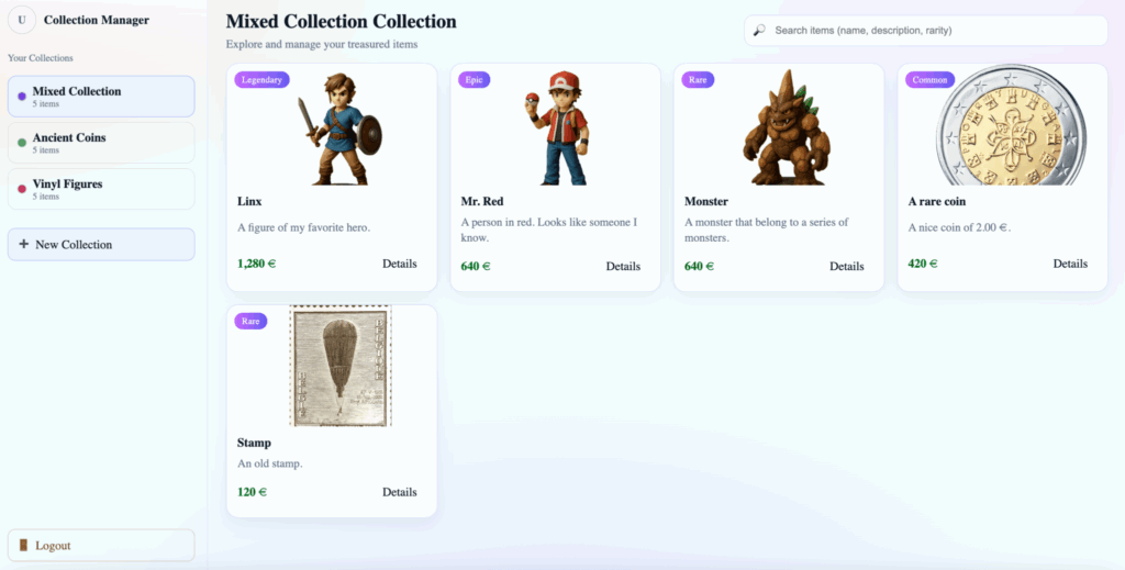
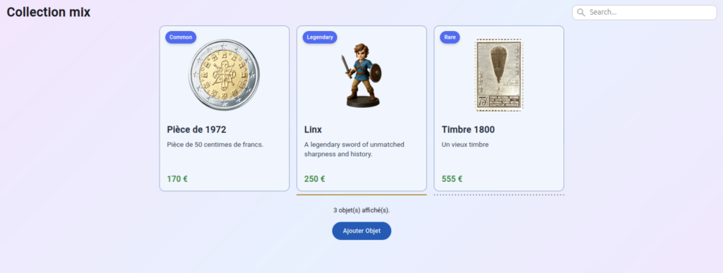
Une fois qu’on a fait tout cela, notre page principale ressemble à ceci :
Personnalisation d’un composant Angular Material
Il y quelques instants, nous avons créé untilisé un MatButton de type « flat » pour le bouton « delete » du composant CollectionItemDetail. Ce bouton est donc bleu. Comme le bouton « delete » est destructeur et sert à effacer un objet de collection, il faudrait plutôt qu’il ait une couleur rouge.
Pour faire cela, on peut personnaliser notre bouton. La personnalisation de composants Material Angular est décrite dans la documentation à la page suivante : https://material.angular.dev/guide/theming. On y retrouve, entre autres, des explications sur le fonctionnement des thèmes et comment personnaliser ceux-ci :
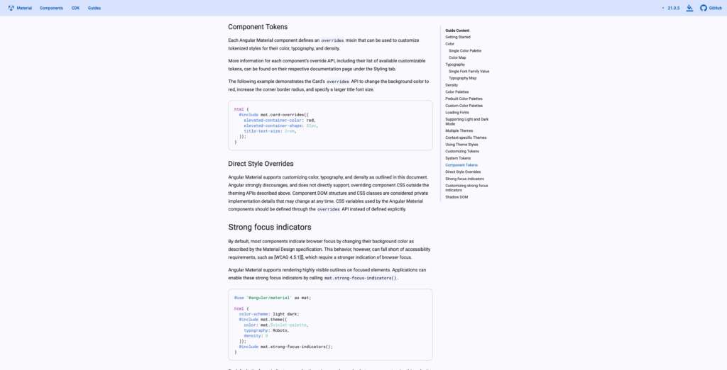
Comme indiqué dans la documentation, chaque composant défini des « Component Tokens » que nous pouvons personnaliser, ces « Component Tokens » se trouvent dans le tab « Styling » du composant que nous souhaitons modifier.
Si on regarde la documentation de notre bouton, on y voit la chose suivante :
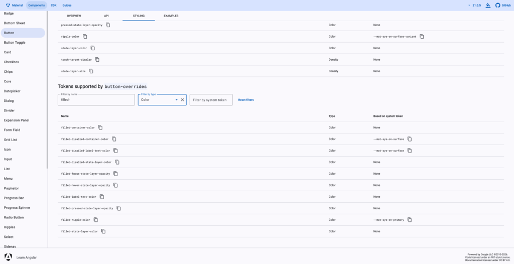
Comme nous souhaitons modifier la couleur d’un bouton de type « filled », les tokens qui nous intéressent sont « filled-container-color » et « filled-label-text-color ». « filled-container-color » contient la couleur du bouton, et « filled-label-text-color » la couleur du texte de celui-ci.
En plus de cela, Material Angular met à disposition un grand nombre de variables de couleurs, définies par les thèmes utilisés. Ces variables peuvent être retrouvées ici : https://material.angular.dev/guide/theming-your-components.
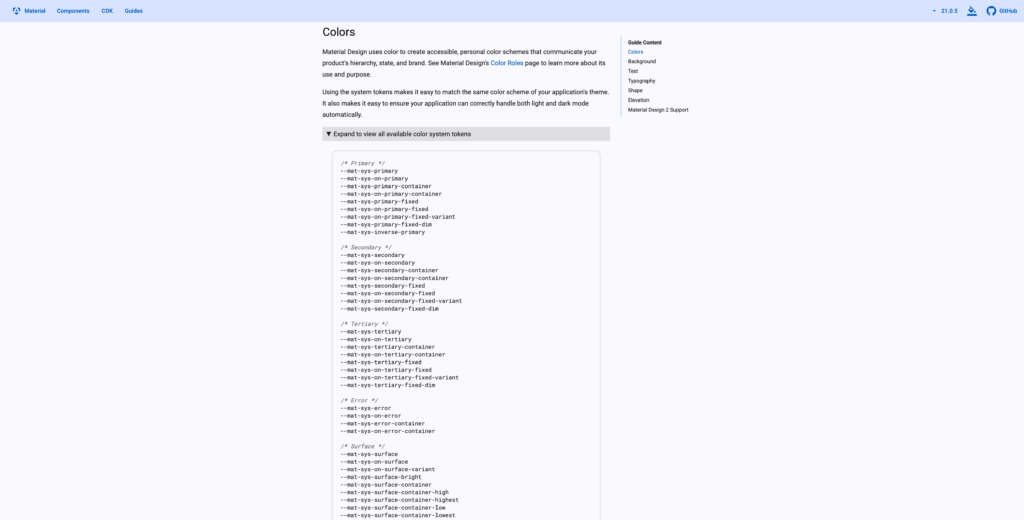
Parmi ces variables, on en a deux en particulier qui vont nous intéresser pour notre bouton « delete »: les variable « –mat-sys-error » et « –mat-sys-on-error ». Ces deux variables sont utilisées par le thème choisi afin de finir la couleur à utiliser pour les cas d’erreur. « –mat-sys-error » représente la couleur à utiliser pour représenter une erreur: c’est cette couleur que nous allons utiliser pour notre bouton. « –mat-sys-on-error » indique la couleur à utiliser pour les éléments qu’on souhaite placer sur une surface qui à la couleur « –mat-sys-error », donc dans notre cas, ce sera la couleur de notre texte.
Maintenant qu’on a vu la théorie, passons à la pratique. Ouvrons le fichier « styles.scss » qui se situe directement dans le dossier « src », et ajoutons une nouvelle classe tout en bas du fichier, qu’on utilisera par la suite sur notre bouton « delete ». On va appeler cette classe « danger » :
...

.danger {
  @include mat.button-overrides((
    filled-container-color: var(--mat-sys-error),
    filled-label-text-color: var(--mat-sys-on-error),
  ));
}Comme vous le voyez, sur les boutons qui ont cette classe, on va appliquer les « button-overrides » nécessaires à changer la couleur d’arrière-plan et de texte du bouton concerné.
Maintenant, on peut appliquer cette classe à notre bouton « delete » :
<app-collection-item-card [item]="collectionItem()" />
<form [formGroup]="itemFormGroup" (submit)="submit($event)">
<mat-form-field class="form-field">
<mat-label for="name">Name : </mat-label>
<input matInput id="name" name="name" formControlName="name"/>
@if (isFieldValid('name')) {
<mat-error>This field is required!</mat-error>
}
</mat-form-field>
<mat-form-field class="form-field">
<mat-label for="description">Description : </mat-label>
<textarea matInput id="description" name="description" formControlName="description" rows="5"></textarea>
@if (isFieldValid('description')) {
<mat-error>This field is required!</mat-error>
}
</mat-form-field>
<mat-form-field class="form-field">
<mat-label for="rarity">Rarity</mat-label>
<mat-select id="rarity" name="rarity" formControlName="rarity">
@for (rarity of rarities; track rarity) {
<mat-option [value]="rarity">{{rarity}}</mat-option>
}
</mat-select>
</mat-form-field>
<mat-form-field class="form-field">
<mat-label for="price">Price : </mat-label>
<input matInput id="price" name="price" formControlName="price" type="number"/>
@if (isFieldValid('price')) {
@let priceFormControl = itemFormGroup.get('price');
@if (priceFormControl?.hasError('required')) {
<mat-error>This field is required!</mat-error>
}
@if (priceFormControl?.hasError('min')) {
<mat-error>The value must be bigger or equal to 0!</mat-error>
}
}
</mat-form-field>
<div class="form-field">
<button matButton="elevated"
(click)="$event.preventDefault(); imageUploader.click();"
>
Upload Image: {{ imageUploader.files?.[0]?.name || '...' }}
</button>
<input hidden #imageUploader id="image" name="image" type="file" (change)="onFileChange($event)">
@if (isFieldValid('image')) {
<div class="error">This field is required.</div>
}
</div><br>
<div class="action-buttons">
<div class="left">
@if (this.itemId()) {
<button matButton="filled" class="danger" type="button" (click)="deleteItem()">Delete</button>
}
</div>
<div class="right">
<button matButton="text" type="button" (click)="cancel()">Cancel</button>
<button matButton="filled" type="submit"
[disabled]="itemFormGroup.invalid"
>
Save
</button>
</div>
</div>
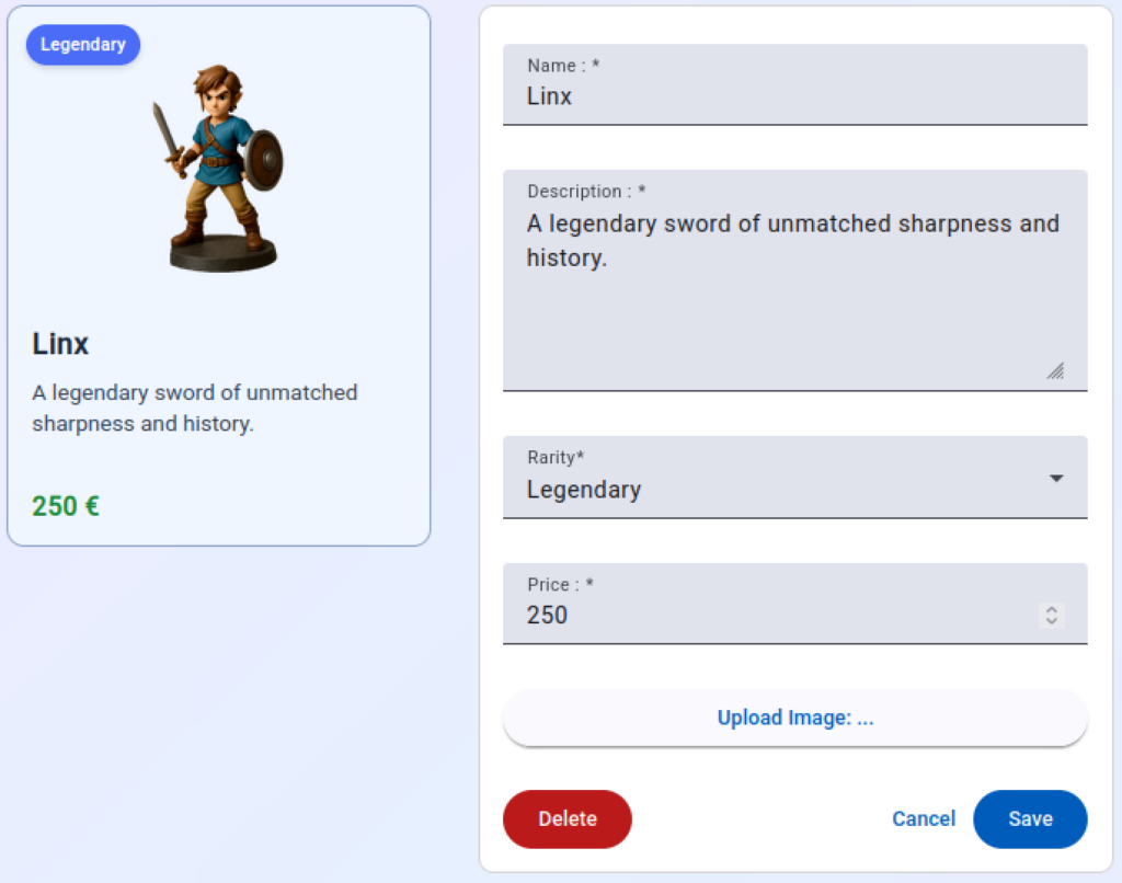
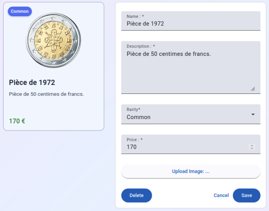
</form>Si on ouvre un objet de collection existant dans notre navigateur, nous voyons que le bouton « delete » est bien rouge :
Et voilà, nous avons maintenant un bouton personnalisé. Bien entendu, les mêmes étapes peuvent être utilisées afin de personnaliser d’autres composants Material Angular.
Ressources
Vous retrouvez ci-dessous un lien vers le code source utilisé dans ce chapitre. Ce lien est uniquement disponible pour les abonnés Standard et Premium.
Quiz
Répondez au quiz ci-dessous afin de vérifier que vous avez bien compris le contenu de cette leçon. Les quiz sont uniquement disponibles pour les abonnés Standard et Premium.